Just Our Type

Division III — Digital Type Design and Typography
 |
When Ross, who grew up in the Los Angeles area, arrived at Hampshire in fall 2003, he had a vague idea that he would concentrate in the arts but was unsure exactly what direction that might take: fine arts or music? As he progressed through his studies, he found himself increasingly interested in graphic design. Undeterred by the lack of a formal graphic design program that would meet his particular needs, Ross ingeniously built his own program, working closely with faculty mentors. He took full advantage of Hampshire's flexibility to create independent study opportunities and looked for other resources that might be available on his home campus, throughout the Five College consortium, and beyond. He obtained the reading list from a design school and read intensively. And he incorporated graphic design into projects in other courses; for example, in an art history course he chose the history of typography as the topic of his final paper.
He enrolled in information design courses at nearby University of Massachusetts Amherst, studying how information and data are communicated through design elements. He arranged two independent studies—one on graphic design and one on lettering—with Donna Cohn, visiting assistant professor of applied design in Hampshire's Lemelson Program. And then he signed up for a Hampshire class, co-taught by Associate Professor of History Jim Wald and Professor of Comparative Literature Jeffrey Wallen, on the organization of knowledge from Gutenberg to Google, and became irretrievably intrigued with how information is stored and accessed visually.
Ross recruited Wald and Cohn for his Division III (senior project) faculty committee, adding Martin Antonetti, curator of rare books at Smith College and past president of the American Printing History Association. Ross titled his project "Digital Type Design and Typography."
"Through a combination of courses and intensive independent work, David put together a systematic program of study and achieved a striking degree of technical skill and aesthetic sensibility," says Wald, who chaired the committee of faculty mentors.
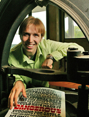
Ross designed five typefaces as part of his Division III, developing them to varying degrees of completion, although he considers none of them fully complete.
He named the first, a semi-serif, Iburne because he spent so many hours working on it at the computer that his eyes began to burn. When he chose the name, the Y was not yet designed; hence, the alternate spelling.
 |
In true Hampshire fashion—after all, "to know is not enough" is the college's motto—he looks for ways to apply his work as he develops it. This was true as early as Division II, when one of his independent studies led him to Youth Action International, a nongovernmental agency founded by an Amherst College alumnus. The organization's mission is development of programs "that help alleviate the suffering of children affected by war or living in difficult circumstances and to empower them to reach their full potential." Ross designed an identity package with brochures, fundraising posters, and a website, and continues to work with the organization today. www.peaceforkids.org
Throughout his time at Hampshire, Ross volunteered to design posters for other students' theater productions. During his Div III, he incorporated his own academic work into these projects, creating custom fonts and lettering for theatrical productions at both Hampshire and UMass.
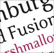
His largest project was the development of a custom type family for Hampshire's student newspaper, The Climax. He later modified the design for use in the 2007 edition of Hampshire's student literary magazine, The Reader.
Another typeface, which Ross named Manicotti, has a design reminiscent of old wood type from the American West. It proved more successful than he ever anticipated. "I just had the urge to get my work out there," he says. "I wanted people with type design experience to see my work and evaluate it." He entered Manicotti in the Type Directors Club 2007 international competition—and won the prestigious Certificate of Excellence. Manicotti is now part of an international type exhibit that will tour the United States, Canada, Europe, and Japan.
"I never expected to win," Ross admits, "but it made me feel that what I was doing was real, not just me in my own world."
Just how real became evident when, looking toward graduation, Ross began to think about his future. How could he turn a passion for type design into a career? With a bit of research he discovered three type foundries that specialize in font development, and contacted them. The Font Bureau in Boston invited him to an interview, looked at his Division III typefaces, and offered him a job. The Font Bureau develops typefaces for some of the country's largest publications.
"Not too many people get to make a living designing type," says Ross, with a grin. "Last year I didn't even know that places like this existed. I learned about the industry, about how people buy, sell, and use type, as part of the research for my Division III."
The Div III also included writing a thesis exploring the relationships between type and handwriting and between type and drafted, sculptural forms. It demanded extensive research, including a visit made with Antonetti to a typefounder who casts metal type in the classic manner, as well as in-depth analysis of how type can be designed for use in the digital age, such as in hypertext applications.
In his evaluation of Ross's 31-page essay, Professor Wald wrote: "It is an eloquent series of meditations, drawing widely and wisely on a body of sophisticated and mostly recent literature. David is the true intellectual or thinking artist that the Hampshire system envisioned: conversant with both theory and secondary literature, able to articulate a vision and convey it eloquently orally and in writing."
The paper included thoughtful analysis of such topics as how specific typefaces work in different print contexts, and how the needs of print and the screen differ in subtle but fundamental ways.
"Until recently type was designed to be applied to a prewritten document," Ross notes. "Today's challenges are different. With desktop publishing, email, and instant messaging, typefaces are now more active participants in the writing process, and need to suit the writer as well as the reader."
Like Wald, Professor Cohn has high praise for Ross's work, including its practical applications. "I've gone from the role of being David's teacher to seeking out his advice on projects," she says. The Lemelson Program's fabrication shop will set up a new computer-controlled cutting tool this summer, and Cohn has asked Ross to design a type that can be cut out of metal. "Type like this does exist, but there is not a lot to choose from," explains Cohn. "I want something that can be optimized for the line quality that this machine produces. This is a perfect extension of David's Div III, and I am delighted to continue to work and learn with him."
In the future Ross may choose to attend one of the graduate programs in type development that he learned about during his Div III research, but for now he looks forward to life in Boston and working, from the comfort of his own apartment, at his dream job designing typefaces.
Article Tags